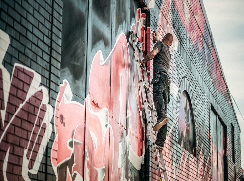
You see those cool graffiti pieces and think, I want to do that. But where do you start? Most tutorials out there assume you already know a thing or two.
Not here. This guide is all about breaking it down into simple, easy steps. Even if you’ve never picked up a spray can before, you’ll be able to create chidos graffitis faciles by the end of this.
We’ll use basic materials you probably already have at home. So, let’s get started. By the time you finish reading, you’ll have your very first piece of graffiti art.
The Building Blocks: Mastering the Core Elements of Easy Graffiti
All complex graffiti starts with simple shapes and letters. Chidos graffitis faciles—cool and easy graffiti—begins with mastering these basics.
Bubble Letters
Bubble letters are soft, rounded, and overlapping, making them very forgiving for beginners. Think of each letter as a balloon, and here’s how to draw them:
- Start by sketching the basic shape of the letter.
- Inflate the shape, making it round and puffy.
- Add details like shadows and highlights to give it depth.
Block Letters
Block letters, on the other hand, are sharp, angular, and structured. They’re built using simple rectangles and squares as a foundation. Here’s a step-by-step guide:
- Draw the basic outline of the letter using straight lines.
- Fill in the spaces to create solid, blocky forms.
- Add small details like serifs or shading for a more polished look.
The Importance of ‘Flow’
Flow means making the letters look connected and move together as one piece, even if they are separate. It’s what gives your graffiti that smooth, cohesive feel.
Try this simple exercise:
– Practice writing the alphabet in both bubble and block styles.
– Focus on the basic forms and how they connect.
– Experiment with different sizes and proportions.
By mastering these core elements, you’ll be well on your way to creating impressive and unique graffiti.
Your First Piece: A Step-by-Step Guide to Drawing a Simple Graffiti Word
Let’s start with the basics. Choose a short, simple word (3-5 letters) for your first attempt. It could be your name or a cool-sounding word.
First things first. Lightly sketch the basic letter shapes with a pencil. Focus on spacing and make sure they touch or overlap slightly to create flow.
Next, build the letter forms. Draw the full bubble or block shape around your initial sketch. Consistent thickness is key here.
Erase the initial pencil guidelines inside the letters. Clean up the drawing, leaving only the final letter outlines.
Ink the outline with a thick black marker. This makes the letters stand out and look bold, a classic graffiti technique.
Mistakes are part of the process, and don’t sweat it if it’s not perfect. The goal is to complete the steps and get a feel for the style.
Now, let’s compare two styles: chidos graffitis faciles vs. more complex designs. Simple graffiti is all about clean lines and easy-to-follow steps. It’s perfect for beginners.
Complex designs, on the other hand, involve more intricate details and can be overwhelming if you’re just starting out.
Simple graffiti lets you focus on mastering the basics. You can always move on to more detailed work once you’re comfortable.
So, grab your pencils and markers, and give it a shot. Remember, the more you practice, the better you’ll get.
How to Make Your Graffiti Pop: Simple Tricks for Adding Style and Dimension
You know, the ‘cool’ factor in graffiti often comes from the little details you add after the letters are drawn. It’s those small touches that make a piece stand out. chidos graffitis faciles
Technique 1: The Drop Shadow
Let me tell you, adding a drop shadow can give your letters a 3D effect that really catches the eye. Here’s how to do it: Pick a direction, like down and to the right. Draw short diagonal lines from every corner, then connect them.
Boom, instant depth.
Technique 2: Highlights
Highlights are another game-changer. Add small white or light-colored rectangles or curves on the letters to make them look shiny and three-dimensional. It’s like giving your letters a spotlight.
Technique 3: The Outline or ‘Keyline’
Adding a second, thicker outline around the entire word can make it jump off the page. This keyline creates a bold, clean look that separates the pros from the amateurs. Trust me, it makes a difference.
Technique 4: Simple Fill-ins and Backgrounds
Filling in the letters with solid colors or simple patterns (like stripes or dots) is a no-brainer. But don’t stop there. Add background elements like drips, stars, or a simple colored cloud shape.
These little extras can take your chidos graffitis faciles to the next level.
By using these techniques, you can transform a basic tag into something that really pops. It’s all about adding those little details that make your work stand out.
Your Beginner’s Toolkit: Essential Supplies You Probably Already Have
When I first started out, I thought I needed all the fancy gear. You know, the expensive spray paint and top-of-the-line brushes. But guess what?
I was dead wrong.
You can learn all the fundamentals on plain old paper. Trust me, it’s way less intimidating and a whole lot cheaper.
Here’s what you really need:
- A basic pencil with an eraser – This is your go-to for sketching and brainstorming.
- Plain paper or a sketchbook – A simple notebook or loose-leaf paper will do just fine.
- A thick black marker (like a Sharpie) – Perfect for bold outlines and making your sketches pop.
- A set of colored markers or pencils – For adding color and flair to your designs.
Each tool has a specific job. The pencil is for getting your ideas down quickly. The eraser helps you fix mistakes without starting over.
The black marker gives your work a clean, professional look. And the colored markers add that extra touch of creativity.
Master your style on paper first. It’s where you can experiment and make mistakes without breaking the bank. Once you feel confident, then you can think about moving to other mediums like chidos graffitis faciles.
So, don’t stress about having the most expensive supplies. Start with what you have, and you’ll be surprised at how far you can go.
You’ve Got the Skills, Now Go Create

You’ve come a long way, learning the basic building blocks, the step-by-step process for drawing a word, and simple tricks to add professional-looking style. Your initial problem—feeling lost on where to start—has been solved. Now, you have a complete roadmap.
The key to getting good at graffiti is consistent practice, not innate talent. Remember, every expert was once a beginner.
chidos graffitis faciles starts with that first pencil stroke. Grab a piece of paper and a pencil right now. Use the steps outlined in this article to draw your first piece.
 Thomason Perezanier is the kind of writer who genuinely cannot publish something without checking it twice. Maybe three times. They came to culinary pulse through years of hands-on work rather than theory, which means the things they writes about — Culinary Pulse, Cooking Hacks and Kitchen Tricks, Regional Taste Deep Dives, among other areas — are things they has actually tested, questioned, and revised opinions on more than once.
That shows in the work. Thomason's pieces tend to go a level deeper than most. Not in a way that becomes unreadable, but in a way that makes you realize you'd been missing something important. They has a habit of finding the detail that everybody else glosses over and making it the center of the story — which sounds simple, but takes a rare combination of curiosity and patience to pull off consistently. The writing never feels rushed. It feels like someone who sat with the subject long enough to actually understand it.
Outside of specific topics, what Thomason cares about most is whether the reader walks away with something useful. Not impressed. Not entertained. Useful. That's a harder bar to clear than it sounds, and they clears it more often than not — which is why readers tend to remember Thomason's articles long after they've forgotten the headline.
Thomason Perezanier is the kind of writer who genuinely cannot publish something without checking it twice. Maybe three times. They came to culinary pulse through years of hands-on work rather than theory, which means the things they writes about — Culinary Pulse, Cooking Hacks and Kitchen Tricks, Regional Taste Deep Dives, among other areas — are things they has actually tested, questioned, and revised opinions on more than once.
That shows in the work. Thomason's pieces tend to go a level deeper than most. Not in a way that becomes unreadable, but in a way that makes you realize you'd been missing something important. They has a habit of finding the detail that everybody else glosses over and making it the center of the story — which sounds simple, but takes a rare combination of curiosity and patience to pull off consistently. The writing never feels rushed. It feels like someone who sat with the subject long enough to actually understand it.
Outside of specific topics, what Thomason cares about most is whether the reader walks away with something useful. Not impressed. Not entertained. Useful. That's a harder bar to clear than it sounds, and they clears it more often than not — which is why readers tend to remember Thomason's articles long after they've forgotten the headline.